
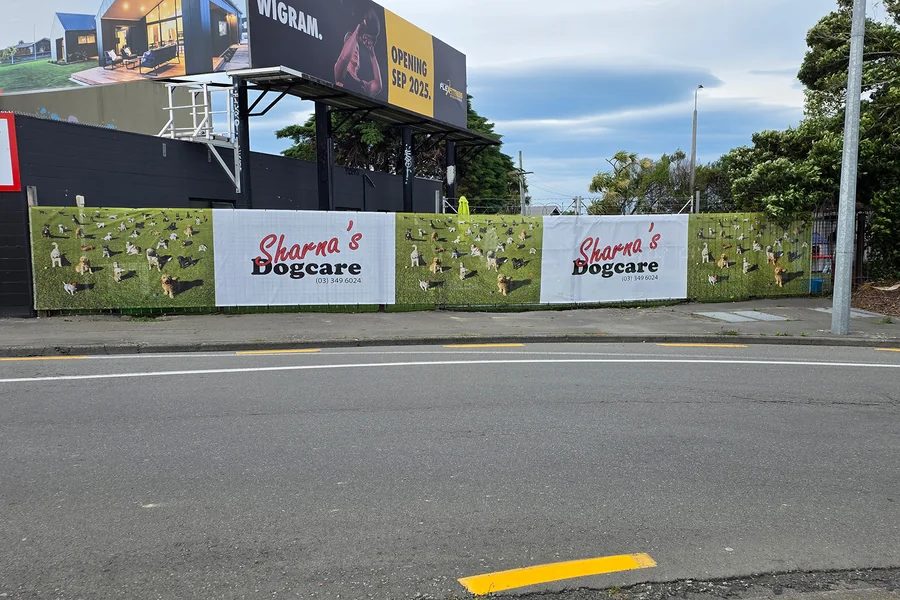
Outdoor graphics have to communicate their messages quickly. Unlike signs that people may stop and study, people generally see fence wraps while they’re walking or driving. A design that looks clear on a computer screen may be difficult to understand once it’s printed across a long fence and viewed from a distance.
Because of certain common design mistakes, many businesses find that their fence wraps aren’t quite as effective as they’d like them to be. Avoiding those mistakes can make a significant difference. It can help ensure that branded fence wrap graphics remain readable and effective in real outdoor conditions.
Using Overly Small Typography
Small text is one of the easiest ways to make a fence wrap difficult to read. Designers are often tempted to include more information by reducing font size. That tends to work against them, though.
It’s important to remember that viewers may only have a few seconds to see the message. Crucial words should be large enough to be readable from the distances where people are most likely to see them. Fonts should also be simple and easy to recognize. Decorative typefaces may look interesting, but they can lose clarity when they’re viewed quickly or from far away.
Having Low Contrast
A strong design also needs enough contrast between its text and background. Light lettering on a light background or dark lettering on a dark background can disappear, especially outdoors where changing sunlight can affect visibility. Color choices should support the message rather than simply match a preferred aesthetic. Testing the design at different brightness levels and viewing distances can help identify areas where text or important graphics become difficult to see.
Using Cluttered Layouts
A fence wrap provides a large canvas, but that doesn’t mean every inch of available space needs to be filled. Too many images, colors, shapes, logos, and messages can compete for attention and make the overall design confusing. A cleaner layout gives viewers an easier path through the information. Leaving some open space can actually make important elements stand out more clearly.
Including Too Much Copy
Fence graphics usually aren’t the right places for long explanations. People who are passing by may not have enough time to read several sentences or a long list of details. The most important message should be easy to identify immediately. Supporting information can be shortened or removed, leaving only what the viewer really needs to see to be able to understand the message itself.
Ignoring Panel Breaks
A fence wrap may be printed across multiple sections, posts, gates, or other physical breaks. If designers don’t account for those features, important words or images can end up being split in awkward places. The layout should be planned around the actual fence structure. Critical text, logos, and other focal elements shouldn’t fall across seams or areas that could interrupt them.
Failing to Establish a Clear Hierarchy
Every element of a design can’t have equal visual importance. When the headline, supporting message, logo, and other details are all competing for attention, viewers may not know where to look first. A strong visual hierarchy makes the primary message the most noticeable aspect, followed by supporting information and secondary details. Size, spacing, placement, and contrast can all help establish this order.
Designing for a Screen Instead of the Real World
Perhaps the biggest mistake people make when designing outdoor graphics is judging them only from a computer monitor. Outdoor graphics may be viewed from sidewalks, parking lots, roads, or other locations where people are much farther away. Traffic speed matters, too. Someone who’s walking past has more time to process a design than someone who’s driving by. Designs that are intended for faster-moving viewers need particularly short messages and strong visual elements.
Before production, it can help to review designs at their intended viewing distances. Considering how quickly the average viewer will pass them is also recommended. A graphic that remains understandable under those conditions is much more likely to accomplish its purpose.
Creating Truly Effective Fence Wraps
A successful fence wrap isn’t simply a large image stretched across a fence. It’s a message designed for a specific environment. By considering typography, contrast, layout, panel breaks, hierarchy, viewing distance, and traffic speed, businesses can create outdoor graphics that remain clear even when viewers only have a moment to see them. That, in turn, will improve the effectiveness of their fence wraps.
